thebza.com » the bza blogs

Masthead header

Culprit – Above the City

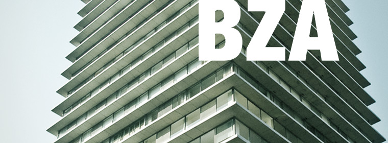
I’m really excited about Culprit’s first label compilation.  The album takes inspiration from their many rooftop sessions at LA’s Standard Hotel, and the album art followed suit.   The parties themselves take place at dusk, well above LA’s streets on top of the historic Superior Oil Company Building, now the Standard Hotel.  The abstracted geometric pattern of the album art is derived from the building’s fenestration, soaked in the rich, saturated colors of a west coast sunset.


Ogilvie

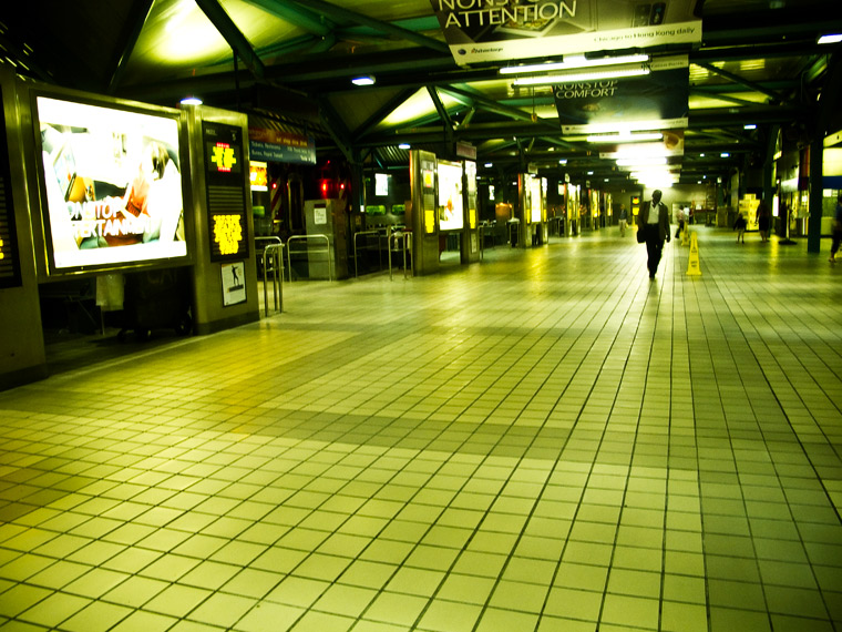
Fact: police officers in borderline tactical gear do not like people taking pictures of empty Metra train platforms.  Not that I blame them for finding it “peculiar”.  But the strange ambiance of the oversized architectural scale and eerie tungsten lights have always had me wanting to shoot photos at Ogilvie.  So I took out my G11 and snapped a few shots while waiting for a friend’s train to roll in.

Hopefully the officers are checking out these photos.  I gave them a business card, and while I don’t think they were particularly interested in my work (“Hey this card would make a great coffee stirrer!”), I do appreciate the work they do.

Culprit Sessions 23

Turned up the sleaze to about 8 or 9 on this one.  I really love the borderline meth-face on the girl.  That’s about as sexy as someone who hasn’t slept for a week can look.

I’m really getting into skanking up the type, too.  I didn’t do any handsetting this time, but everything got a good dose of noise, median, map-displacement distortion, and individual blurring.


Orchard Lounge All Vinyl Set

Orchard Lounge wanted something whipped up for their all vinyl, 7 hour marathon set coming up at Smart Bar.  I’d had a notion of doing a sort of cascading set of pictorial elements motif in the past, but never attempted it.  So when my first drafts for this project went south, I gave it a shot.  While I would have preferred not to use my own sausage shaped fingers in the piece, I don’t have any hand models lounging around my apartment on weekday afternoons (YET).  So I started snapping away.

The effect was thrown together rather quickly.  It could be much more polished, but on a squeezed deadline, it still reads as it needs to.  Just don’t mind the hot dog fingers.

Culprit Sessions 22

The Culprit Sessions magazine cover theme took a relatively large leap in time this month from the 60’s and 70’s to the late 80’s.  And for Hot Natured, why not?

I’ve been experimenting more and more with finding ways to give the type work a realistic printed look, or at least matching the feel of pre-modern print presses.  This go around (with a few exceptions) I actually hand set each letter of each word to ensure that the overall feel was pre-Photoshop.  It’s a time consuming venture (throw in hitting all type with noise, motion blur, and displacement map distortion), but hopefully worth it in the end.